Parchita
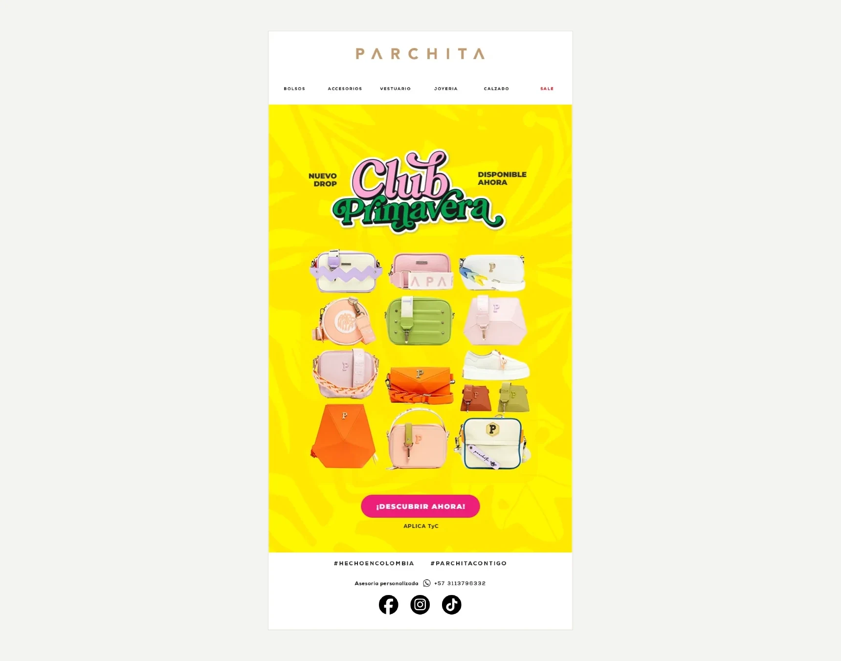
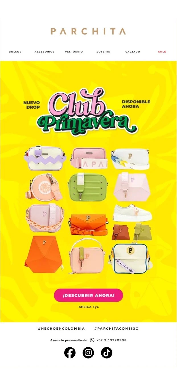
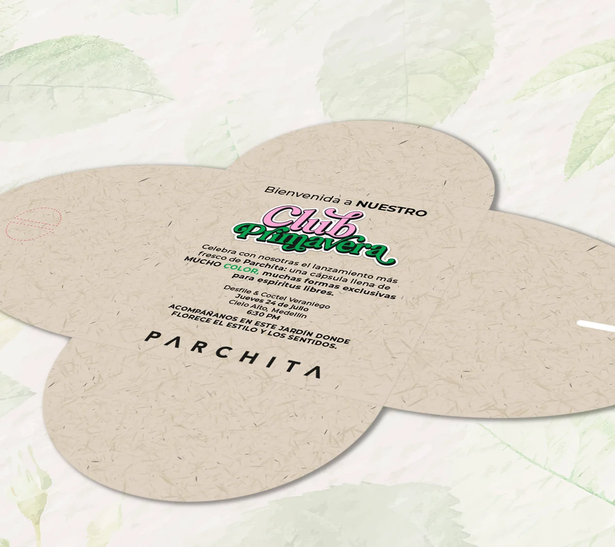
A packaging proposal for the launch of a Parchita capsule collection that celebrates color. I named it Club Primavera, a secret urban garden where fashion blooms, and built it into a four-piece system: a key visual, a die-cut invitation, a PR box with three gifts inside and a launch newsletter.
About the project
The brief asked for a capsule launch with joy, strength, diversity and freedom of expression. The answer was a world of its own with a central line, "La primavera florece en ti" (spring blooms in you), a six-color palette in tune with Parchita's identity and two typefaces: Mitogen for display and Montserrat for text.
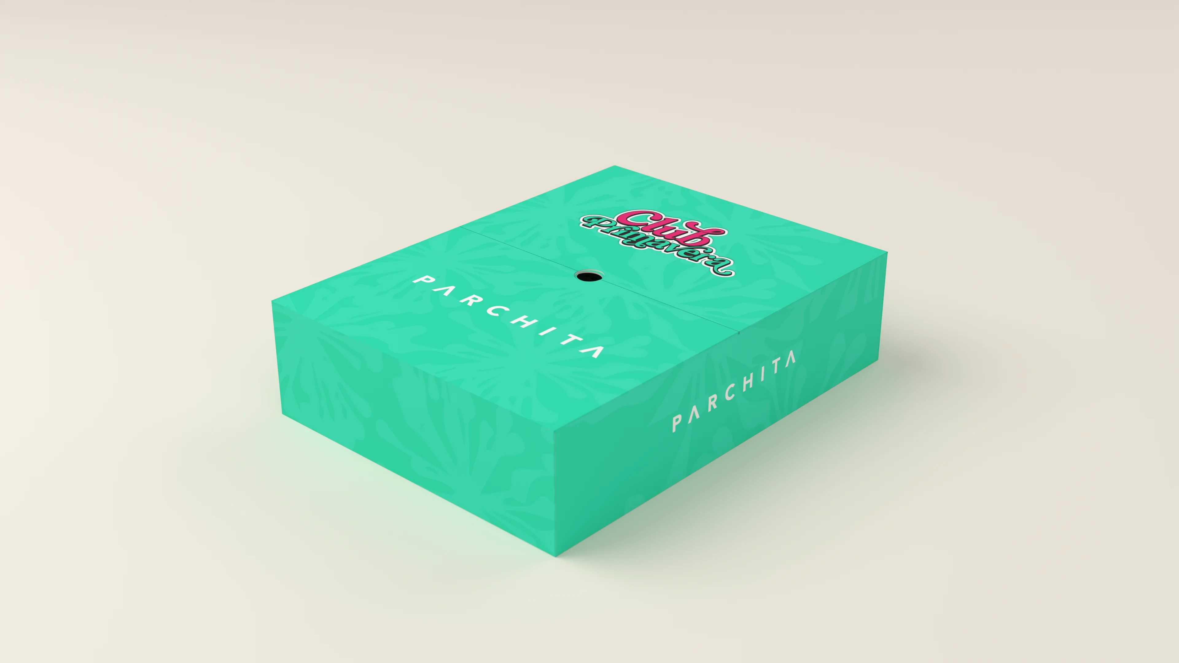
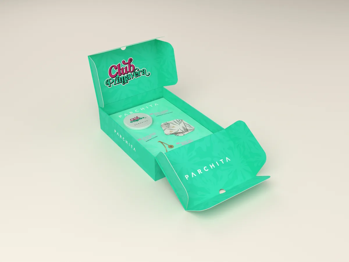
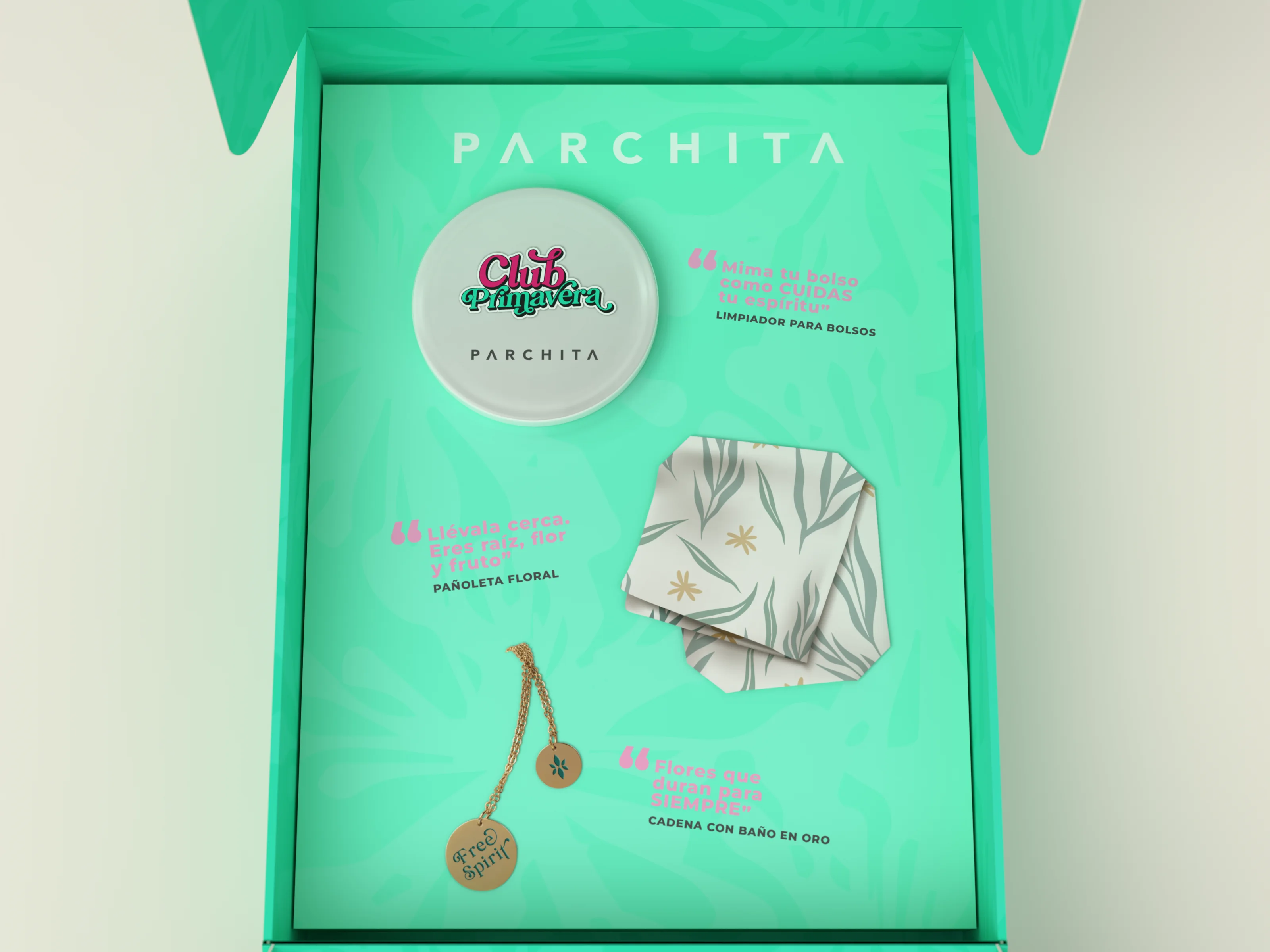
The PR box measures 30 × 40 × 10 cm: two lids that open like doors, double side walls, the logo and a QR code on the base, and an insert with a bag cleaner, a floral scarf and a gold-plated chain, each with its own line.
To present it I built it in 3D from the original dieline, outside print, inside print and insert, so you can see how it opens, what is inside and how it reads closed.
PR box · Die-cut invitation · Key visual · Newsletter · 3D modeling
02A secret urban garden
Key visualKey visual
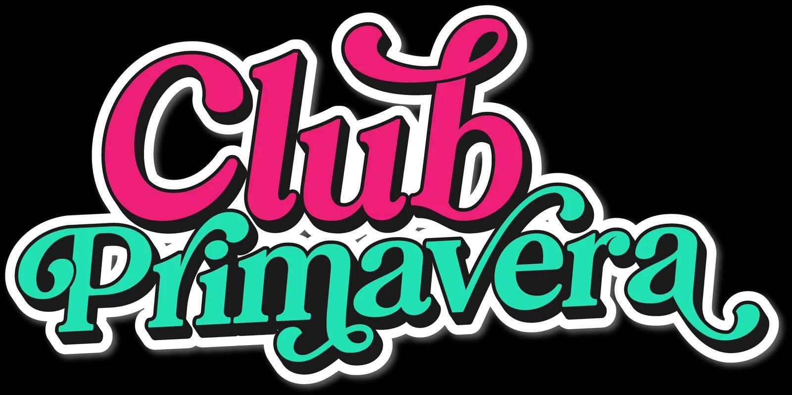
- 01Name Club Primavera.
- 02Concept a secret urban garden where fashion blooms. This capsule collection is an invitation to rediscover color through color, joy and freshness. With a contemporary aesthetic, it draws on spring as a symbol of personal renewal, creative freedom and natural beauty.
- 03Central line "La primavera florece en ti" (spring blooms in you).
- Fuchsia#ED1E79
- Pink#FCA7D5
- Yellow#FFE800
- Mint#22E1B5
- Green#07A34D
- White#FFFFFF
Inspired by powdery, sophisticated and natural tones, in tune with Parchita's current identity. This palette keeps the joy of spring. It brings happiness, freshness and youth.
03An invitation that blooms
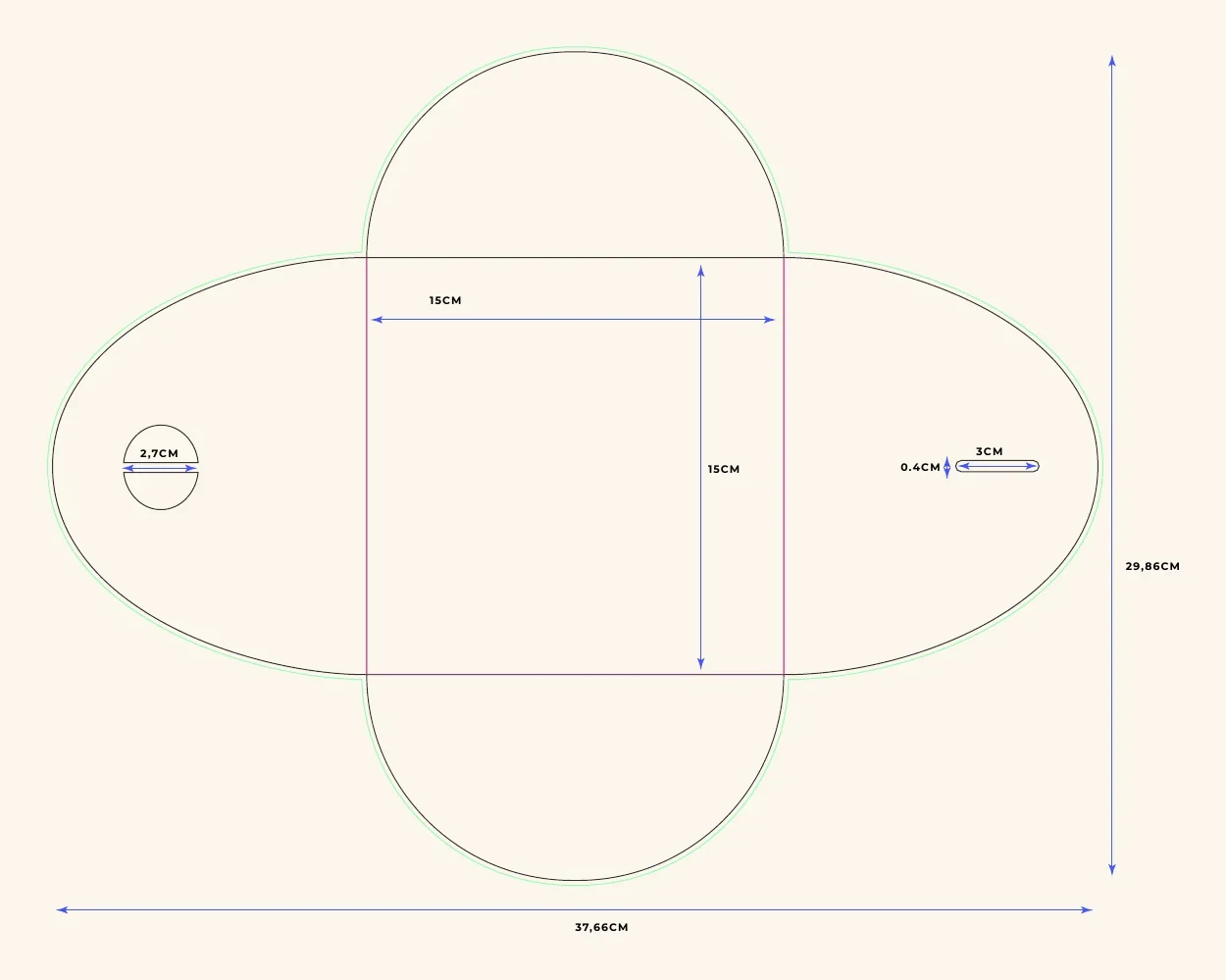
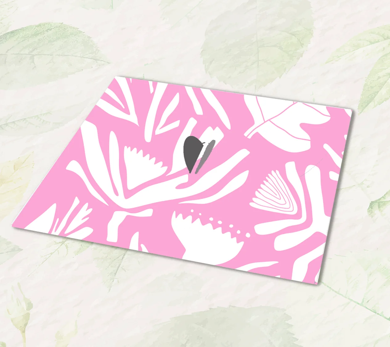
01 Dieline
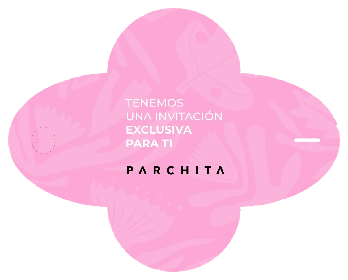
02 Outside print
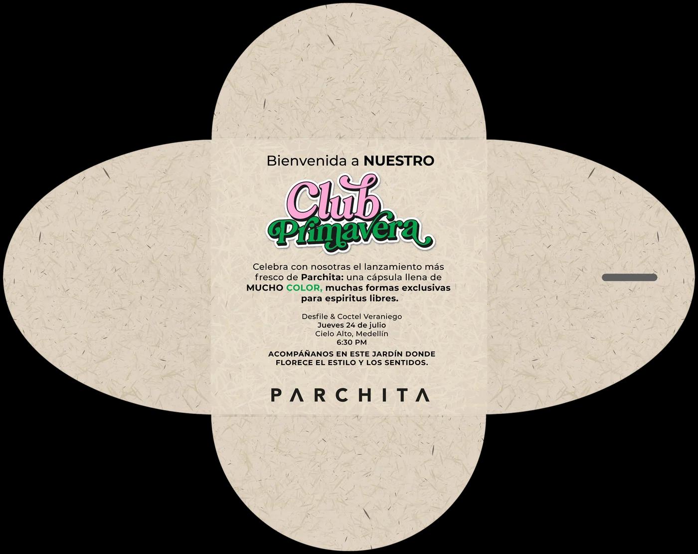
03 Inside print
04What arrives at the door
30 × 40 × 10 cm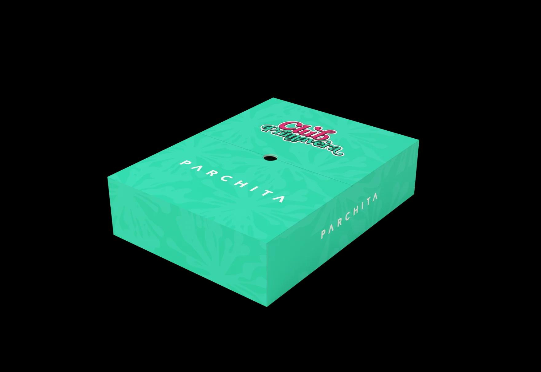
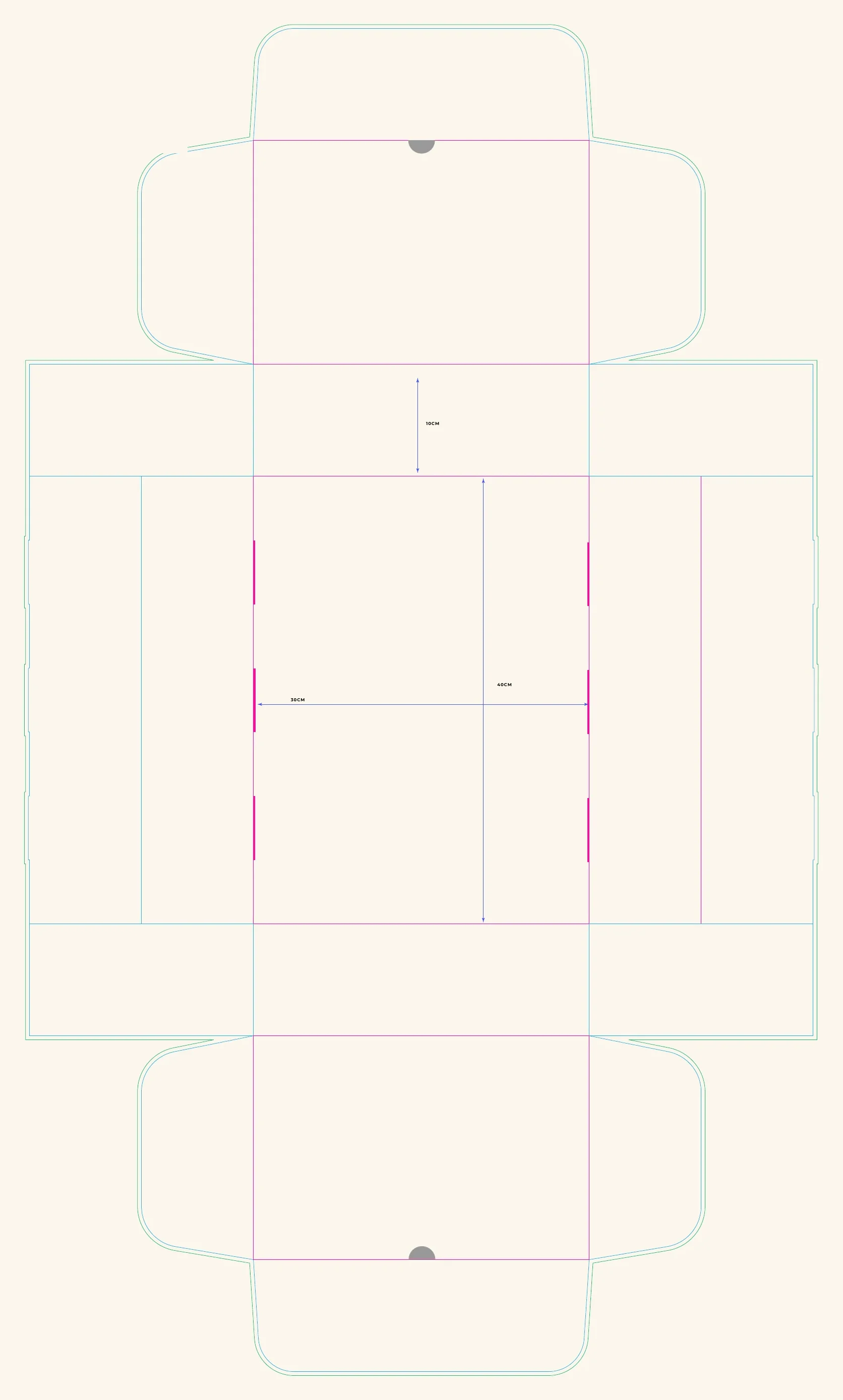
01 Dieline
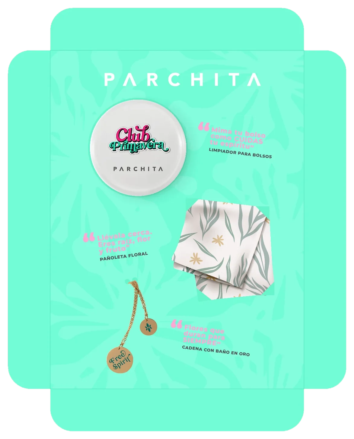
02 Insert
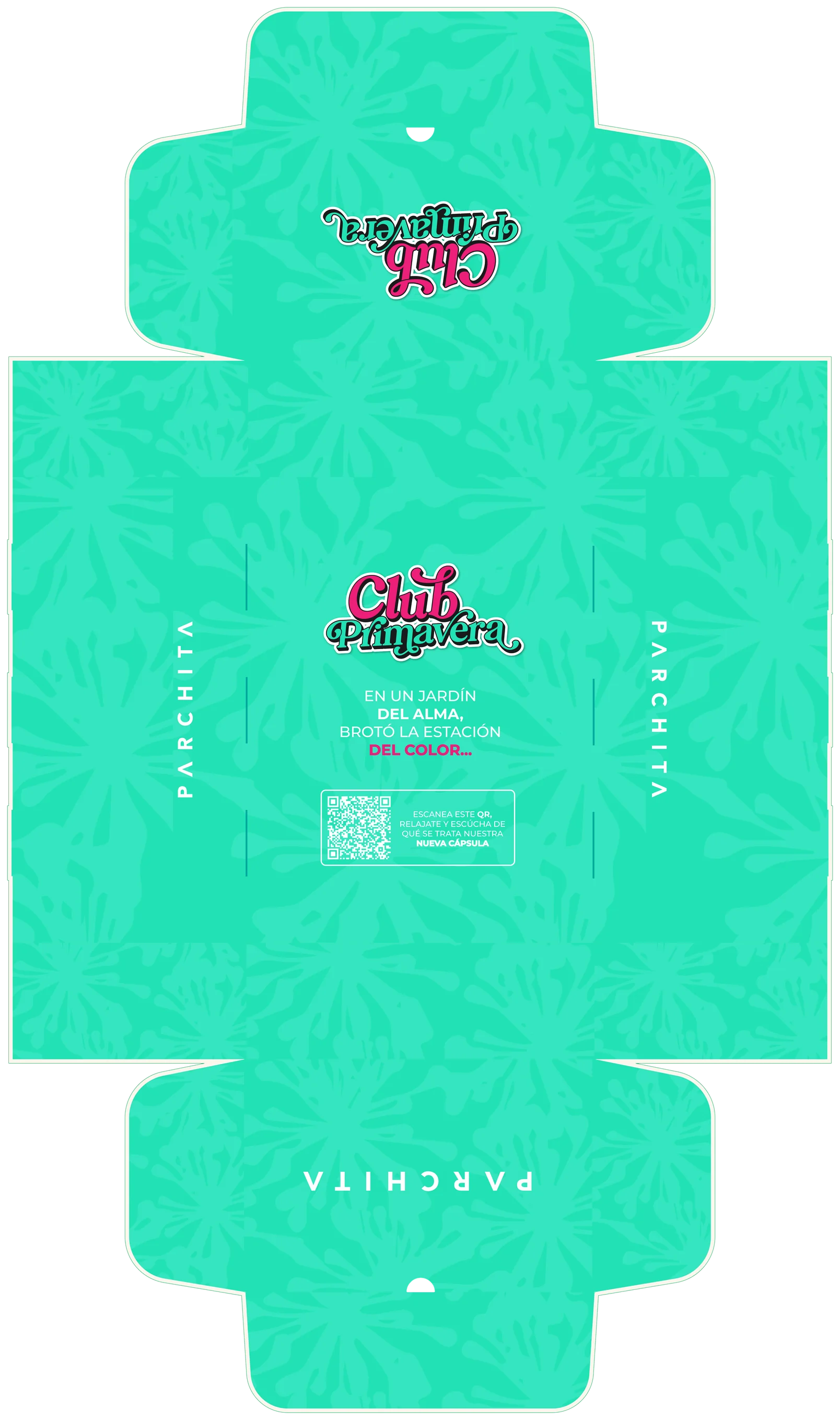
03 Outside print
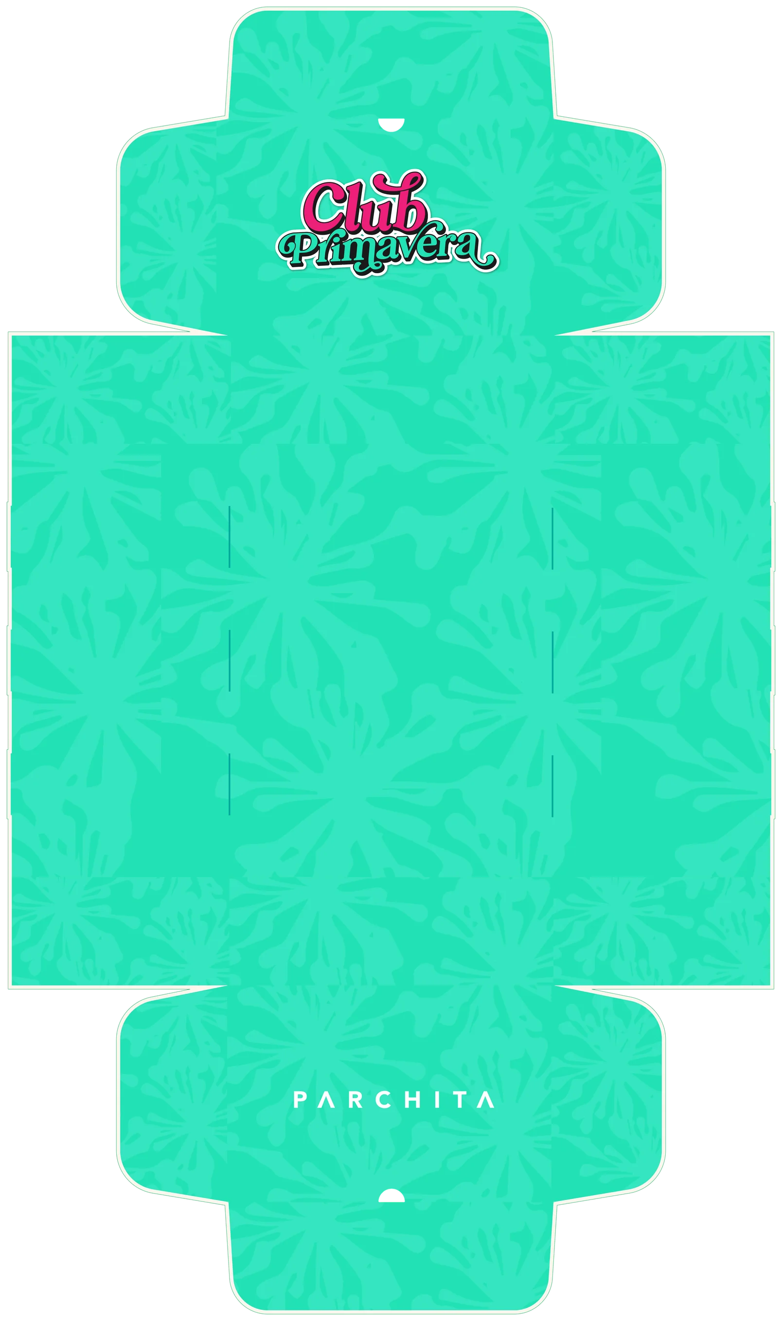
04 Inside print
05The launch email